









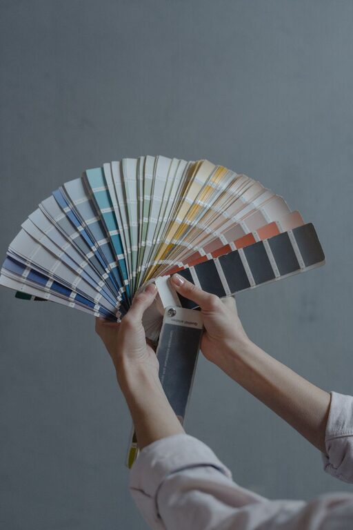
Creating a peaceful and inviting home environment often starts with the colors you choose for your walls and decor. Calm colors can help reduce stress, improve mood, and provide a soothing backdrop for your daily life. Whether you’re repainting a single room or updating your entire home, selecting the right calm colors can transform your space into a haven of tranquility.
In this post, we’ll guide you through practical tips for choosing calm colors that complement your style and lifestyle.
Why Choose Calm Colors for Your Home?
Calm colors are typically soft, muted, or pastel shades that evoke feelings of relaxation and serenity. These colors can:
– Reduce anxiety and stress
– Improve focus and mindfulness
– Encourage restful sleep
– Create a welcoming atmosphere
By integrating calm colors into your home, you’re designing a space that supports your well-being and comfort.
Popular Calm Color Choices
Before diving into tips, here are some commonly used calm colors:
– Soft Blues: Known for their peaceful qualities, blues can remind us of the sky or water.
– Gentle Greens: Representing nature, green tones often bring freshness and balance.
– Warm Neutrals: Beige, taupe, or soft greys create cozy and versatile backdrops.
– Pastel Lavenders: Light purples offer a subtle touch of color with calming effects.
– Muted Pinks: Soft blush tones can add warmth without overwhelming the senses.
Tips for Choosing Calm Colors for Your Home
1. Understand the Mood You Want to Create
Consider how you want to feel in each room:
– Bedrooms: Ideal for relaxing colors like light blues or lavenders.
– Living Rooms: Warm neutrals or soft greens foster comfort and socializing.
– Bathrooms: Light blues or soft greens enhance a spa-like effect.
– Home Office: Muted blues and greens can improve concentration without distracting.
Knowing the mood helps narrow your color options to those that support your goals.
2. Test Colors in Different Lighting
Colors can look very different depending on natural and artificial lighting:
– Natural Light: Morning and afternoon sunlight can warm or cool a color’s appearance.
– Artificial Light: Choose bulbs with warm or cool tones to preview how paint looks at night.
Paint large swatches on the wall or use sample boards to evaluate colors at various times of day before committing.
3. Start With a Neutral Base
Calm colors don’t have to be bold. Starting with a neutral base like soft grey or beige allows flexibility with accents and décor:
– Create a timeless look that’s easy to update.
– Add pops of calm color through furniture, pillows, or artwork.
4. Use Color Theory to Harmonize Your Palette
Choose colors that work well together:
– Analogous Colors: Select colors next to each other on the color wheel (e.g., blue and green) for a gentle, harmonious effect.
– Monochromatic Shades: Choose variations of the same color with different shades and tints for subtle depth.
Avoid high-contrast or overly bright colors that disrupt calmness.
5. Consider the Size and Function of the Room
– Small rooms: Use lighter calm colors to make the space feel larger and airier.
– Large rooms: Slightly deeper calm hues can add coziness.
Also, think about the function of the room to select colors that support its use.
6. Balance Warm and Cool Tones
While cool tones like blues and greens are calming, incorporating warm tones like soft peach or warm beige can add inviting warmth:
– Alternate walls or accessories with warm and cool calm colors.
– Use warm wood or metallic finishes to complement the palette.
7. Choose Matte or Satin Finishes for Paint
Glossy finishes can reflect light harshly and disrupt the soothing effect. Instead:
– Opt for matte or satin finishes that diffuse light softly.
– These finishes tend to hide imperfections and create a more relaxed atmosphere.
8. Incorporate Natural Elements
Colors found in nature tend to feel calming:
– Bring in natural textures like wood, stone, or linen that complement calm colors.
– Use houseplants to add greenery and fresh air, reinforcing the tranquil vibe.
9. Don’t Forget Accent Colors
Even in calm color schemes, a few well-placed accent colors can energize a room without overwhelming it:
– Soft yellows, gentle coral, or muted teal can add interest.
– Use accents sparingly through cushions, throws, or small decor items.
10. Personalize Your Choices
What feels calm to one person might not for another. Trust your instincts and preferences:
– Consider how colors make you feel personally.
– Mix and match until your space feels just right.
Final Thoughts
Choosing calm colors for your home is about more than aesthetics—it’s a way to foster peace, comfort, and happiness every day. By understanding your mood goals, testing colors carefully, balancing tones, and incorporating natural elements, you can create a serene sanctuary where you love to spend time.
Take your time during the process, enjoy experimenting with samples, and let your home reflect the calm you want to feel inside.